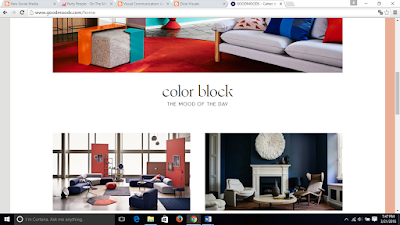
Good Moods is a website that my mother visits
frequently to get ideas when we remodel pieces of our house. I think this is a
great example of web design because of the consistent layouts, simple page structures,
and the color balance as you surf which make the experience easy and pleasant.
The home page is simple, proportional and lays out
everything in order for you to navigate where you want to go. The title and
headlines are visible with boldness and readable with proper spacing. The gutters
along the sides start with colors that match or compliment the items shown which
is easy on the eyes as you surf the pages. Every headlines links to another
page, information or an item displayed so it is easier to maneuver around the
site.
Good Moods illustrates strong grind design with its
quiet page structure with vertical and horizontal boxes that also maintains
balance of colors. I feel that each color was purposeful and precisely placed
in the site because their displays are some complimentary to one another at all
times.
What I like about Good Moods is that it is colorful
and creative. My mother has an old-fashion style, but Good Moods allows her to
expand her horizons when it comes to interior design and a more modern look.
This is compatible on-the-go as well when you look at this webpage on your
phone, so you can always share ideas with others anytime, anywhere!


No comments:
Post a Comment